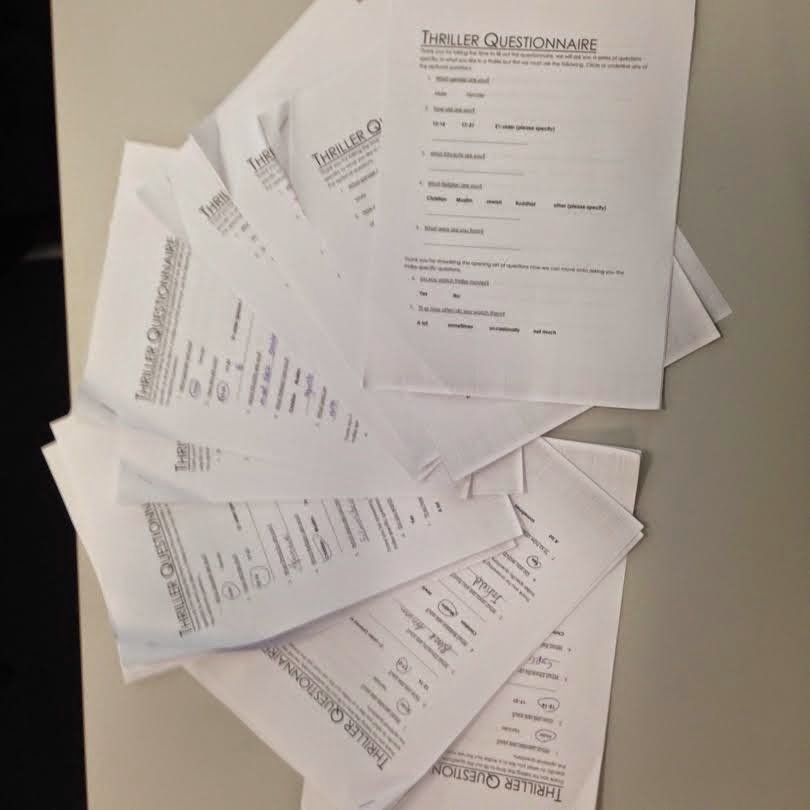
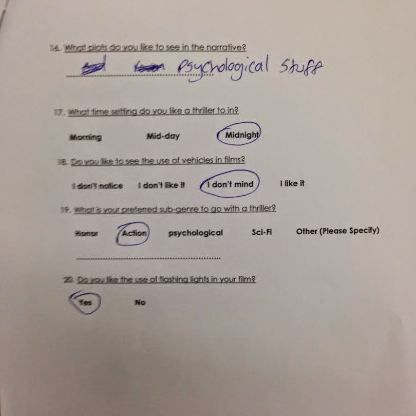
Results from questionnaire
What is the important get back and analyse feedback? Relate to direct, specific audience feedback.
The most important answers to get back and analyse would be the thriller based questions because that is the most important information you need for reseach the diegetics would be a secondary or an add on even because it isn't as important.
Example of various graphs you created
Example 1 - The bar chart/graph:
This graph is the most basic and easy to read of all the graphs, I chose this specific graph for this question because this question was a closed question so I could only get a yes or no answer and seeing as there was eith one answer or another there was no point in using a more detailed graph, this one shows everything I need. How many people in total answered and how many said either yes or no.
However there was times when i had used the barv graph for multiple choice questions but this was selected as the preffered graph only because there was no 'other' answer given so other didn't need to be specified.
Example 2 - Pie chart/graph:
The pie chart was my chosen graph for the more high detailed questions with more various options used. This is because the graphy uses a circle diagram and breaks down each slice of the circle as a different answer and breaks it down into a percentage giving a clearer undertand of what percentage of people chose what option. This graph helped especially for the "what is your favourite thriller weapon?" question because there were many options to chose from.
How has the research been beneficial
The research has been beneficial because it has helped me gain understanding of what the target audience want to see in my thriller and the graphs have made it clearer and easier to read, which is better than just tallying the answers of my reseach


